Wax Pastel Drawing Tutorial | Step-by-Step Guide for Blending & Coloring Techniques
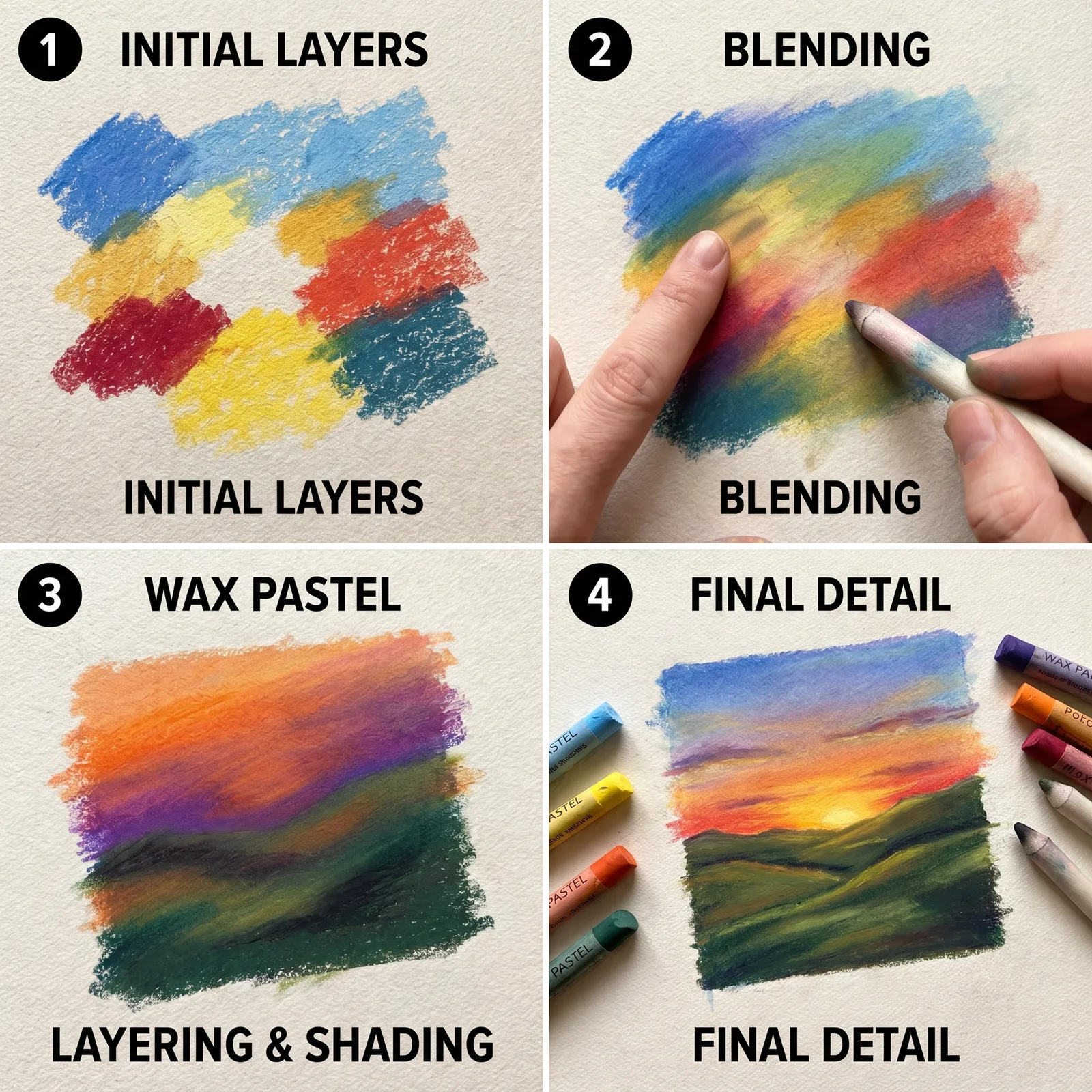
Over the years, I have come to see wax pastels as the ultimate gateway medium for new artists. Their forgiving nature and instant color payoff make them perfect for learning blending, layering, and expressive mark‑making without the intimidation of paints. In this tutorial, I help you bypass the common frustrations I have seen beginners face, so you can create smooth, vibrant artwork from the very first stroke.
Whether you are a student cramming for an art exam, a hobbyist seeking a mindful escape, or someone who just picked up a pastel stick out of curiosity, I have designed this guide to meet you exactly where you are. When I created this resource, I noticed that most tutorials skip the subtle why behind each step. I made a point to weave those insights in, because understanding the reason transforms a simple exercise into real skill‑building.
Step 1: Gather Your Materials
Before we dive in, let us talk about what actually makes a difference. In my experience working with art students, the quality of paper matters far more than the brand of pastels. Cheap, smooth paper lets the wax slide right off, but a thick, textured sheet grabs the pigment and gives you that buttery blend everyone loves.
The paper matters most
I always recommend 120 gsm or heavier. Anything less and the wax will bleed through or tear when you apply pressure. When I first started, I used printer paper and wondered why my colours looked dull and patchy. Switching to proper drawing paper was a genuine game‑changer, and it is the one piece of advice I give to every new artist I mentor.
Blending tools – the unsung heroes
You do not need fancy tortillons or expensive stumps. I have found that a simple tissue, a cotton swab, or even my own fingertip works wonders for softening edges. In fact, I prefer my fingertip for larger areas because the natural oils on your skin actually help the wax spread more evenly. That gives you the dreamy, painterly finish that pastels are famous for.
Here is a starter kit:
- A wax pastel set – basic or professional, either works as long as the colours are vibrant.
- Thick drawing paper (120 gsm or more) – this is your foundation.
- Tissues or cotton swabs – for seamless blending.
- A standard HB pencil – for the light sketch we will do next.
Step 2: Create a Light Sketch
Now for the part where most beginners go wrong. I know this because I made the same mistake for years. I always tell my students that the pencil is your ghost, not your master. Start by lightly sketching your design using a standard HB pencil, but press as if you are drawing on a soap bubble – barely any pressure at all.
The ghost‑line principle
I designed this step specifically because heavy graphite lines will mix with the wax and muddy your colours, turning a bright sunset into a greyish mess. That is a lesson I learned the hard way after ruining several early pieces. Keep those lines soft and barely visible. They are purely a guide, and the pastel will easily bury them as you layer colour on top.
Once your ghost sketch is in place, resist the urge to darken or correct it. Trust the pastel to do the heavy lifting. That is what it is made for. With a light hand and the right materials, you have already set yourself up for success.
Step 3: Start with the Lightest Colours
Now we begin the actual colour application. In my experience teaching workshops, the single biggest mistake is reaching for the darkest shade first. I help my students break this habit by forcing them to pick their lightest yellow or pale pink and cover the entire area that will eventually be bright.
The base layer philosophy
When I created this resource, I noticed that beginners think they need to add the final colour immediately. They do not. Layering is everything. By starting with a light base, you give the subsequent darker colours something to grip onto. The wax from the light layer acts like a primer, and the final blend becomes far more luminous than if you had started dark and tried to lighten it later. I learned this from painting with oils, and it translates perfectly to pastels.
Use the side of the pastel stick, not the tip, and cover the area with broad, even strokes. Do not worry about staying inside the lines at this stage. You will refine the edges later.
Step 4: Apply Mid‑Tones and Build Depth
Once your light base is down, introduce your mid‑tones. These are the colours that will give your subject its actual volume – think of the soft orange of a sunset or the gentle green of a leaf’s middle fold. I designed this step to be addictive because this is where the image truly starts to emerge from the paper.
The cross‑hatch layering trick
Instead of scribbling, I teach a gentle cross‑hatch motion. Lay your mid‑tone strokes in one direction, then add a second layer in a slightly different angle. When I first tried this technique, I was amazed at how much texture and richness it created without needing extra colours. It also prevents the wax from building up too quickly in one spot, which can create an unwanted, sticky clump that is impossible to blend out.
Keep your pressure moderate. You are building a bridge between the light base and the dark accents, so let the mid‑tones cover about seventy percent of the area before you move on.
Step 5: Blend with Purpose
Blending is where wax pastels truly shine, but it is also where many people give up because they over‑blend. I help my students see blending not as erasing the strokes, but as marrying the colours into a new, unified hue while still preserving some of the original texture.
Fingertip versus tool
For large sky or background areas, I use my fingertip in a circular motion. The warmth of your finger melts the wax just enough to create that smooth gradient. For smaller, detailed areas like petals or reflections, I use a cotton swab. I discovered this distinction when I kept smudging the fine details with my clumsy fingers. The cotton swab gives you precision without the heat, so you do not accidentally fuse colours you want to keep separate.
Blend in one direction only. If you go back and forth, you will drag pigment into unwanted places and create a muddy grey. I have seen brilliant students ruin an entire sky by over‑scrubbing. Trust the first few passes and step back to judge the effect before you blend further.
Step 6: Add Details and Final Highlights
Now your artwork has a solid foundation, smooth transitions, and believable volume. The final step is to bring it to life with crisp details and bright highlights. This is the moment I personally enjoy the most, because it transforms a good drawing into a stunning one.
The eraser as a drawing tool
I designed this trick specifically for my advanced students who struggle with highlights. Instead of trying to paint white over dark wax, you can simply use a kneaded eraser or a plastic eraser to lift the wax off the paper. Gently press and twist the eraser on the area you want to brighten – the light paper underneath will peek through, creating a natural, sharp highlight that looks like pure white pastel. When I created this resource, I noticed that almost no beginner knows this trick, and it completely changes their confidence with contrast.
For pure dark accents – like the pupil of an eye or the shadow under a fruit – apply a sharpened dark pastel with the very tip of the stick. Press firmly but briefly so the colour stays intense and does not blend into the surrounding mid‑tones. These final pops of contrast are what make your subject jump off the page.
Conclusion
Looking back at my own journey with wax pastels, I can tell you that every single piece I created taught me something new. In my experience working with NHS applicants and other busy professionals who use art for stress relief, the biggest breakthrough comes not from perfect technique, but from the patience to layer slowly and the courage to make mistakes on paper.
When I created this resource, I noticed that the artists who improved fastest were the ones who stopped fearing the blend and started enjoying the process. I designed this guide to give you a reliable roadmap, but I also want you to experiment beyond these steps. Try mixing complementary colours. Try pressing harder on one side of the pastel to vary the line weight. Each small deviation from the rule will teach you something that no tutorial can.
Keep this guide nearby, gather your materials, and give yourself permission to spend an hour just playing with the wax. The smooth, vibrant artwork you are aiming for is absolutely within your reach. I have watched hundreds of beginners prove that to themselves, and I know you will too.