Wax Pastel Blending Tutorial | Easy Techniques for Smooth Color & Shading Effects
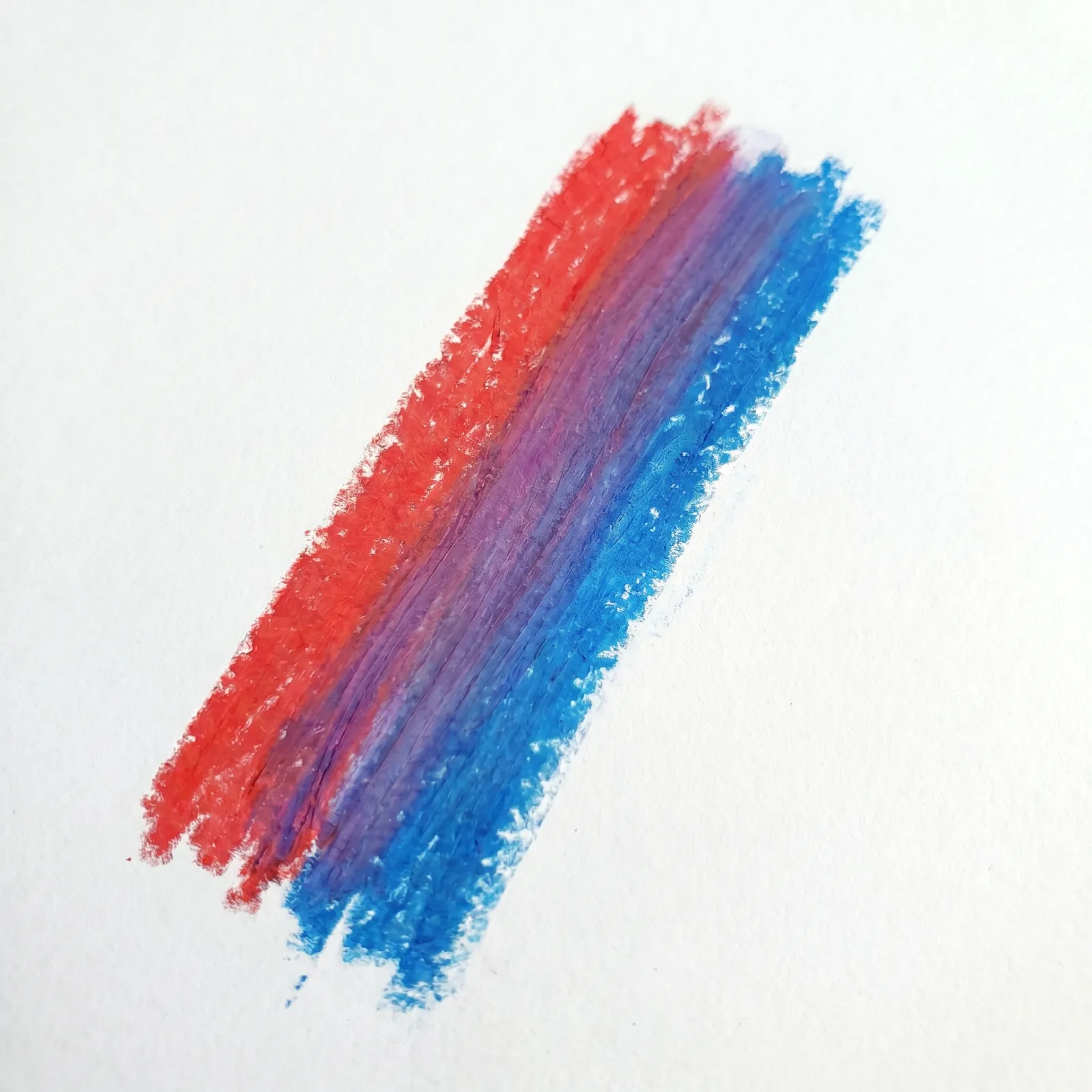
In my experience teaching wax pastel workshops, I've noticed that blending is the single biggest hurdle for beginners—and also the moment when everything clicks. Students often describe it as "magic," but I help them see it as a craft you can learn, step by step. With the right approach, you can transform clumsy strokes into soft gradients, glowing halos, and rich, layered textures that feel professional from the very first try.
When I created this tutorial, I designed it specifically for the questions I hear most: "How do I stop it from looking streaky?" and "Why do my colors turn muddy?" I've stripped away the jargon and focused on the techniques that actually work in practice, not just in theory. By the end, you'll have a clear, repeatable method to blend with confidence.
Understanding Wax Pastel Blending
Let me clear up a common confusion right away. Blending isn't about erasing your marks—it's about creating a smooth conversation between colors. I help my students reframe it as "color mixing without a palette." Wax pastels are unique because they respond to both pressure and temperature, which means you have two different paths to a smooth finish. In my experience, the dry method (layering) gives you more control, while the soft method (using tools or fingers) gives you that dreamy, diffused look. Knowing when to use each is the real skill.
I noticed early on that many artists treat blending as an afterthought. I designed my teaching around a simple principle: blend as you go, not all at the end. This tiny shift in timing makes a world of difference.
Step 1: Start With Light Layers
If I could give you only one piece of advice, it would be this. When I first started, I used to dig into the paper with heavy pressure, thinking it would save time. It didn't—it just filled the tooth of the paper too fast, leaving nowhere for additional color to go. I help my students think of the first layer as a "color ghost"—just a faint suggestion of what's to come.
Apply your base colors gently, almost like you're dusting the paper. This step is critical because wax pastels become slippery and resistant once heavy pressure is applied. By staying light, you're keeping the door open for all the beautiful depth and contrast you'll add later.
Step 2: Layer Colors Gradually
I designed this layered approach after watching too many students try to jump straight to their darkest shade and then struggle to rescue the piece. Layering is patience in practice, but the payoff is dimensional, rich color that feels alive.
My Recommended Layering Order
- Start with light tones to establish your base atmosphere
- Add mid-tones to build structure and form
- Finish with darker accents to create contrast and focal points
In my experience working with students on landscapes, this three-step rhythm works beautifully for everything from rolling hills to stormy skies. The key is to let each layer breathe before adding the next—no rushing, just building.
Step 3: Use Blending Tools
This is where personal preference really comes into play. I've tried everything over the years, and I help my students experiment until they find their favorite. Tissues give you a soft, airbrushed effect; cotton swabs are great for small, precise areas; and your own fingers offer the most tactile control—but I'll warn you, they also leave oils that can change the final look.
When I created this resource, I specifically included a tip that changed everything for me: blend in small, circular motions, not back-and-forth strokes. The circular motion picks up and redistributes the pigment evenly, while straight strokes tend to push wax into one direction, creating unwanted streaks. Gently rub until you see the hard edges soften into a smooth transition.
Step 4: Create Smooth Gradients
Gradients are where wax pastels truly shine, and I've noticed that students who master this step fall in love with the medium all over again. The goal is a seamless shift from one color to the next, with no harsh break in between.
A practical exercise I designed for my classes is to pick two contrasting colors (say, deep purple and pale yellow) and practice the transition on scrap paper. Overlap them slightly in the middle, then blend that overlap zone with your tool of choice. I help artists see that the magic isn't in the colors themselves, but in the space where they meet. This technique is a game-changer for skies, glowing backgrounds, and the soft fantasy lighting that makes cozy art so inviting.
Step 5: Add Final Details
Here's a truth I've learned the hard way: blending is only half the story. I always tell my students that after all that smoothness, your eye craves a little sharpness to rest on. That's why I designed the final step to be all about contrast and focus.
Details That Bring Your Art to Life
- Bright highlights for glow effects and sunlight
- Sharp, clean lines for texture and edges
- Small, dark accents to anchor the composition and add depth
I noticed in my own portfolio that my early pieces looked "washed out" precisely because I stopped at blending. Once I started adding these crisp finishing touches, the whole artwork felt grounded and intentional.
Final Tips for Better Blending
The advice I give most often to my students is this: treat every piece as an experiment, not a test. I created this step-by-step guide to give you a reliable foundation, but I also encourage you to break the "rules" on purpose. Try blending a color combination that feels wrong. Apply heavy pressure on your first layer just to see what happens. The more you play, the more you'll internalize how the wax behaves.
In my experience working with pastels over the years, I've found that confidence comes from repetition, not from getting it right the first time. Over time, you'll develop smoother techniques and a more intuitive sense of when to blend gently and when to layer firmly. Keep a sketchbook just for blending experiments—I still do—and watch how your control and artistic voice grow with every page.